


Color in interior design
Color in interior design
The importance of color in interior design
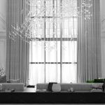
Color is an essential component of interior design, as it has the power to transform a space and create a specific mood or atmosphere.
Color psychology, which focuses on the use of color to create a particular mood and atmosphere, is a key aspect of interior design.
The colors used in a space can set the overall mood and atmosphere, which can significantly impact the occupants’ emotional state and well-being.
The color wheel is a circular representation of colors that helps designers understand how they relate to each other. There are three primary colors – red, blue, and yellow – and three secondary colors – green, purple, and orange – that are created by mixing two primary colors. Tertiary colors are created by mixing a primary and a secondary color.
For example, shades of green can create feelings of serenity and balance, while deep shades of blue can evoke a sense of calmness and relaxation. Thus, color is a crucial element in creating a functional and aesthetically pleasing interior design.
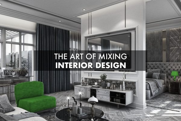
Creating visual interest and contrast is another important aspect of interior design, and color plays a significant role in achieving this goal.
Contrast is the use of opposite or vastly different elements to create visual interest and depth. Patterns, textures, and shapes can all be used to create contrast, but color is one of the most effective tools for achieving this goal.
Mixing and matching colors can add personality to a space and make it more dynamic and visually appealing.
Therefore, color is an essential element in creating a visually interesting and engaging interior design.
Color Harmonies
Color harmonies are combinations of colors that work well together. They are based on the relationships between colors on the color wheel. The most common color harmonies are:
- Complementary: Complementary colors are opposite each other on the color wheel, such as red and green or blue and orange. They create a bold contrast and can be used to create a focal point in a space.
- Analogous: Analogous colors are next to each other on the color wheel, such as blue, blue-green, and green. They create a harmonious and calming effect and are often used in nature-inspired designs.
- Triadic: Triadic colors are evenly spaced around the color wheel, such as red, yellow, and blue. They create a vibrant and energetic effect and can be used to create a bold statement in a space.
The colors used in interior design can also reflect personal style and taste. Color choice is a matter of personal preference and can significantly impact the overall look and feel of a space. The use of bold colors can reflect a more daring and adventurous personality, while neutral colors can indicate a more subdued and relaxed style. The careful consideration of color can unify furnishings and finishes to produce a cohesive and pleasing result. Thus, color is an essential element in creating an interior design that reflects the occupant’s personal style and taste.
Color physiology
Understanding the Physiology of Color Perception
Color perception is a complex process that involves both the eye and the brain. The human eye is capable of distinguishing up to 10 million different colors within the visible spectrum, which ranges from ultraviolet light to red light.
The perception of color is dependent on the role of light and color receptors.
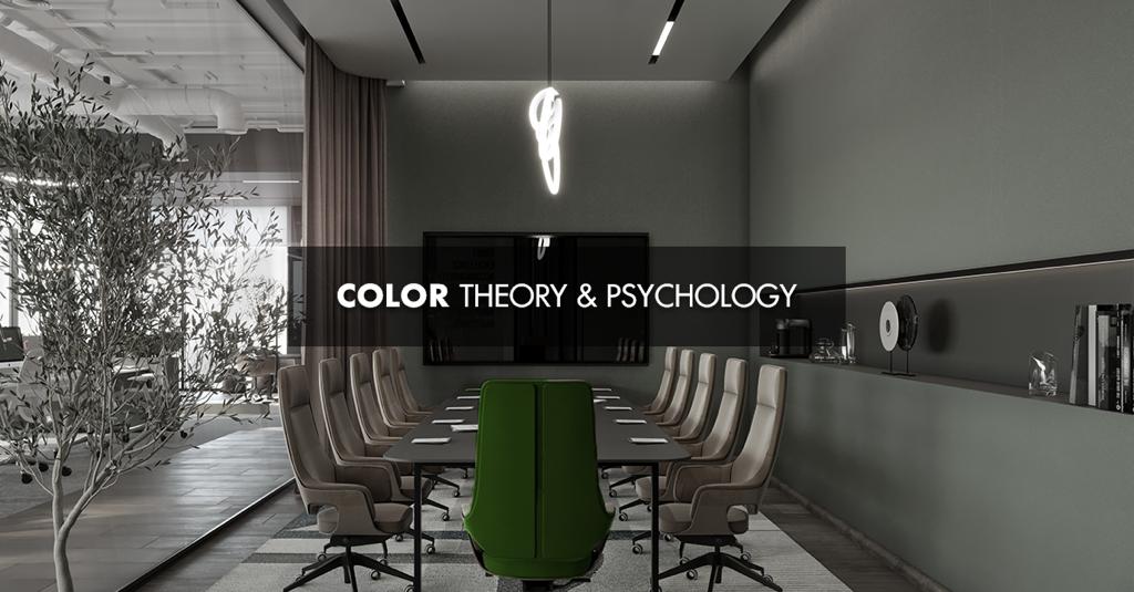
Color Psychology
Color psychology is the study of how colors impact our emotions and behavior. Different colors can evoke different emotions and affect our mood and behavior in various ways. Here are some examples of how colors can impact our emotions:
- Red: Red is associated with energy, passion, and excitement. It can also stimulate appetite.
- Blue: Blue is associated with calmness, serenity, and trust. It can also promote productivity and efficiency.
- Yellow: Yellow is associated with happiness, optimism, and creativity. It can also stimulate mental activity and memory.
- Green: Green is associated with balance, harmony, and nature. It can also promote relaxation and reduce stress.
- Purple: Purple is associated with luxury and sophistication. It can also enhance spirituality.
- Orange: Orange is associated with warmth, enthusiasm, and excitement. It can also stimulate appetite and promote social interaction.
In conclusion, color theory and psychology are essential in interior design.
By understanding the relationships between colors and their impact on our emotions and behavior, designers can create spaces that are functional, aesthetically pleasing,
and emotionally satisfying. Careful consideration of color theory and psychology
can help designers create spaces that meet the needs and preferences of their clients while creating a positive and memorable experience for anyone who enters the space.
You can follow us on Social media Facebook, instagram and Linkedin